Brand · Jan 12, 2026 · 7 min
The ACTIVED visual identity begins
Why ACTIVED exists as an umbrella brand and how its visual identity connects games, tools and future experiments.
ACTIVED began as a practical answer: one shared identity for projects that do not always belong to the same format. A game, a digital tool or a creative experiment may need different languages, but they can still share the same base: build, test, improve and publish.
The idea was not to create the facade of a large company or pretend a structure that does not exist yet. ACTIVED works as an umbrella brand: a visual and editorial core that organizes public work without erasing each project personality.
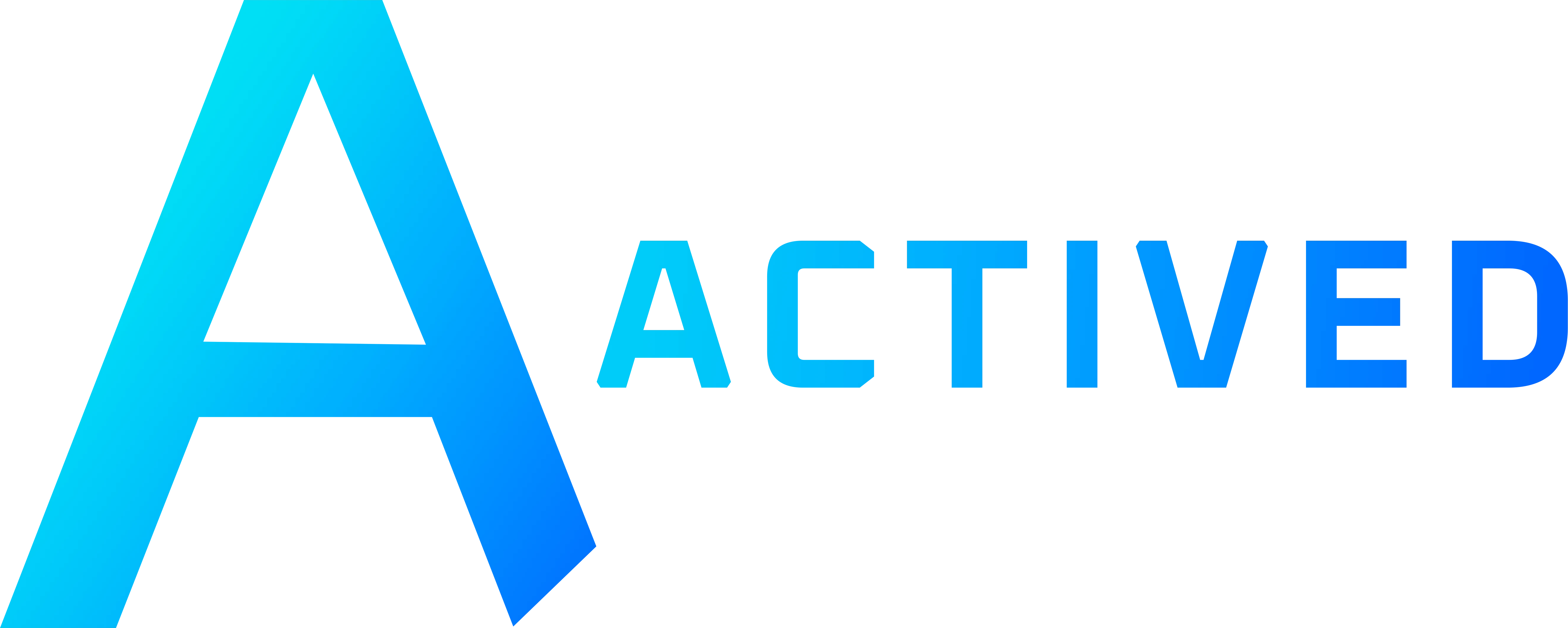
The main logo was developed around a synthetic, technical and recognizable A. The diagonal cut in the right leg became more than a symbol detail: it is a visual rule that can move into buttons, masks, cards, dividers and transitions without always depending on the full logo.
ACTIVED GAMES appears as a natural branch of that identity. It keeps the ACTIVED base, but shifts the energy toward a violet and blue mix suited to games, prototypes, playable systems, trailers and devlogs. It is not a separate brand: it is an active public division inside the same system.
The main palette combines cyan and blue because it communicates precision, technology and clarity. Violet enters when the web speaks about ACTIVED GAMES, adding a more creative layer without falling into excessive neon or generic gamer styling.
The identity can reserve space for future ideas without turning them into public promises too early.
ACTIVED should keep following that logic: a flexible, honest identity strong enough to grow with new projects, while always staying connected to real visible work.